
This document provides a comprehensive overview of Gather's Key Project Insights, designed to empower you with a powerful tool for tracking project progress.
Understanding Key Insights
Gather offers visually appealing dashboards and data visualizations to equip you with a clear understanding of your project's health. We recognize that every project is unique, and thus, we provide customized insights tailored to your specific needs.
By leveraging our Key Insights, you can:
Maintain a clear view of project progress.
Gain valuable data-driven insights to inform your decision-making.
Gather offers a variety of dashboards to cater to your project management needs:
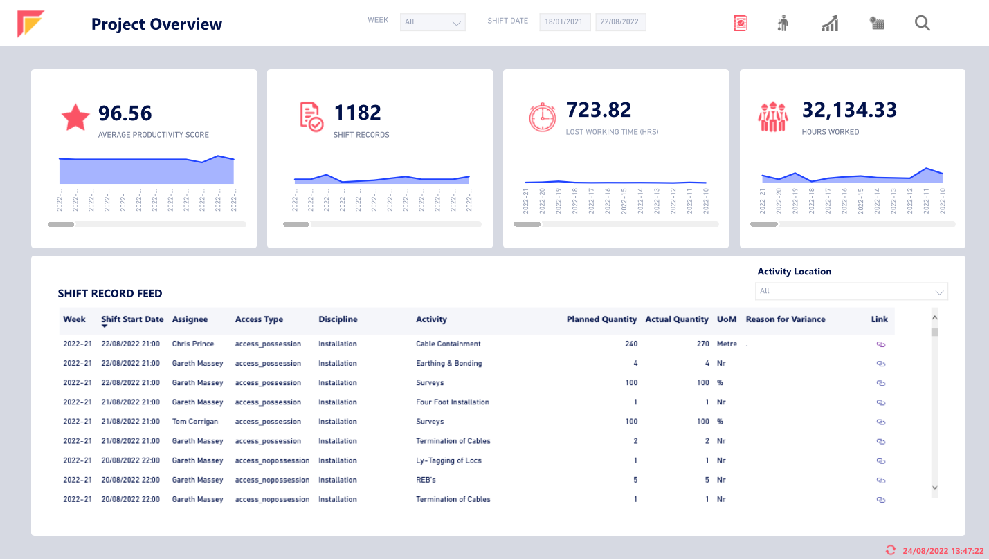
Project Overview
(Provides a high-level view of project health)
Visualizes average Shift Productivity Score and total average. (weekly and total)
Shows total Shift Record count and total records. (weekly and total)
Visualizes Lost Working Time per week and total Lost Working Time.
Shows the number of hours worked per week and total hours worked.
Provides a Shift Record feed table with details like Week, Assignee, Project Name, etc.
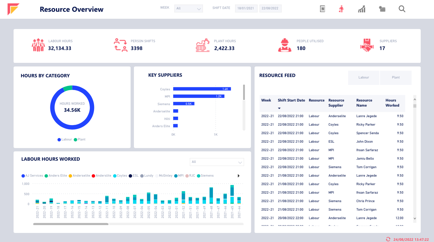
Resource Overview
(Focuses on resource utilization)
Key Performance Indicators (KPIs) for Labour Hours, Plant Hours, and Suppliers.
Donut chart showing weekly Labour and Plant hours breakdown.
Clustered bar chart highlighting Key Suppliers and their activity.
Shift table with details on Resource Labour Hours and Resource Labour Supplier (by working week).
Resource Feed table with details like Week, Resource, Resource Supplier, and Hours Worked.
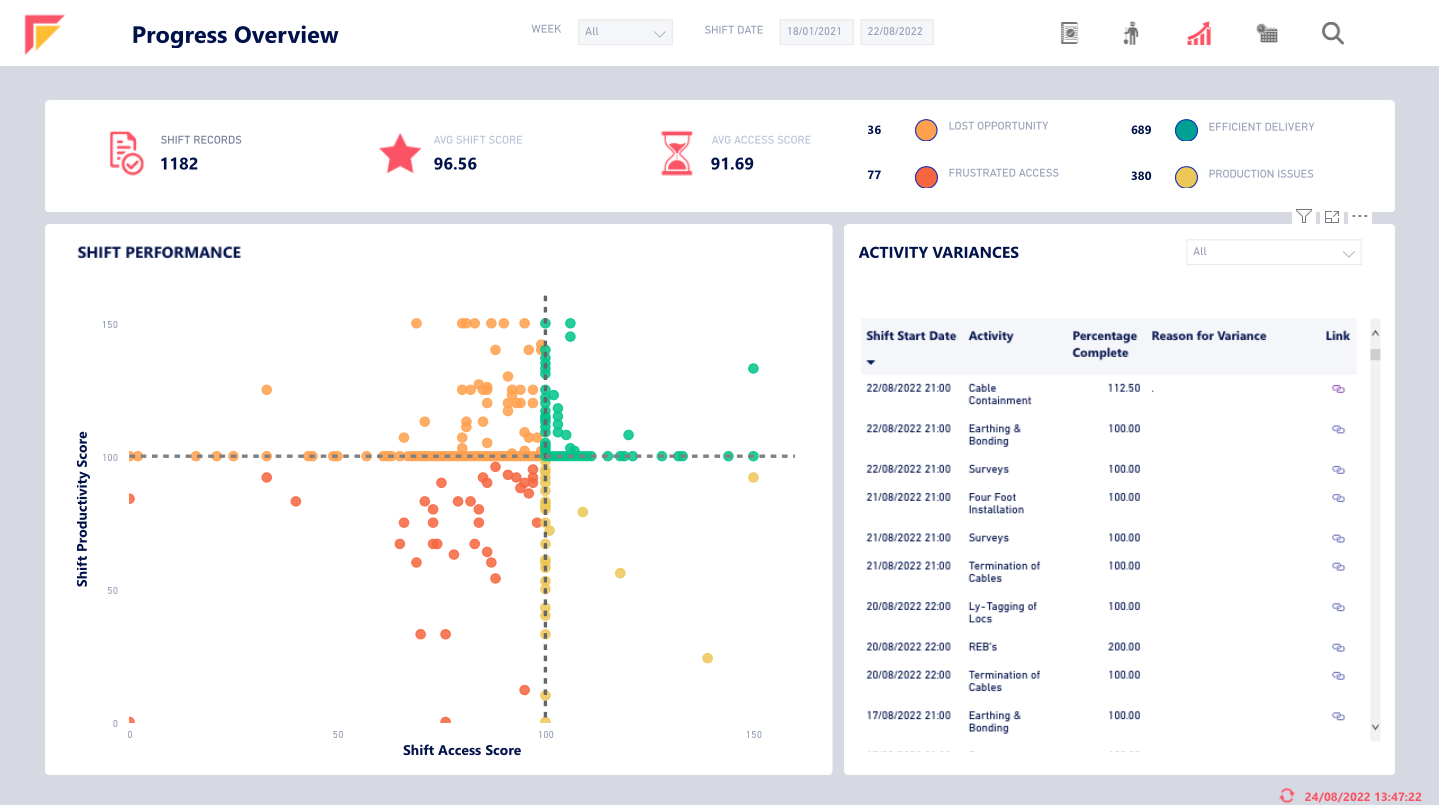
Progress Overview
(Tracks project progress against goals)
KPIs for Shift Records, Average Shift Score, and Average Access Score.
Cluster scatter chart analyzing Shift Score vs Access Score.
Activity performance table with details like Shift Start Date, Activity completion percentage, Reason for Variance, and link to the Shift.
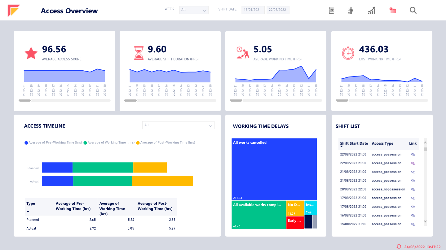
Access Overview
(Analyzes access patterns and efficiency)
Visualizes average Shift Productivity Score per week.
Visualizes average Shift Duration per week.
Visualizes average Actual Working Time and Lost Working Time (all weekly).
Compares planned vs actual Working Time.
Presents a tree graph for reasons behind work delays.
Provides a full list of Shifts with details like Start Date, Access Type, and link to the Shift.
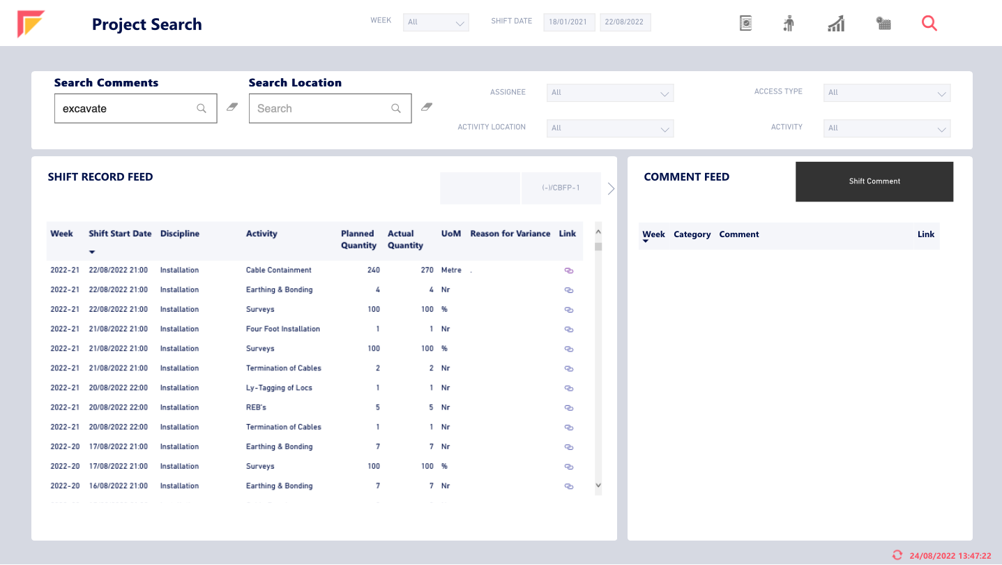
Project Search
(Enables filtering and searching of project data)
Search functionality for comments and location.
Filters for Assignee, Access Type, Activity Location, and Activity.
Shift Record table with details like Week, Start Date, Discipline, Activity, etc.
Comment feed table with details like Week, Category, Comment, and link.